第五章主要对WPF中的界面如何布局做一个较简单的介绍,大家都知道:UI是做好一个软件很重要的因素,如果没有一个漂亮的UI,功能做的再好也无法吸引很多用户使用,而且没有漂亮的界面,那么普通用户会感觉这个软件没有多少使用价值。
一. 总体介绍
WPF的布局控件都在System.Windows.Controls.Panel这个基类下面,使用 WPF提供的各种控件在WPF应用程序中界面进行布局,同时对各种子控件(如按钮、文本框,下拉框等)进行排列组合。

Pane类的公共属性太多了。就简单介绍几个常见的属性如下表。
| 名称 | 说明 | |
| Cursor | 获取或设置在鼠标指针位于此元素上时显示的光标。 | |
| DataContext | 获取或设置元素参与数据绑定时的数据上下文。 | |
| Dispatcher | 获取与此 DispatcherObject 关联的 Dispatcher。 | |
| FontFamily | 获取或设置控件的字体系列。 | |
| FontSize | 获取或设置字号。 | |
| FontWeight | 获取或设置指定的字体的权重或粗细。 | |
| Foreground | 获取或设置描述前景色的画笔。 | |
| HandlesScrolling | 获取一个值控件是否支持滚动。 | |
| Height | 获取或设置元素的建议高度。 | |
| HorizontalContentAlignment | 获取或设置控件内容的水平对齐。 | |
| IsLoaded | 获取一个值,该值指示是否已加载此元素以供呈现。 | |
| IsMouseOver | 获取一个值,该值指示鼠标指针是否位于此元素(包括可视树上的子元素)上。这是一个依赖项属性。 | |
| IsTabStop | 获取或设置一个值控制是否在选项卡上导航包含。 | |
| IsVisible | 获取一个值,该值指示此元素在用户界面 (UI) 中是否可见。这是一个依赖项属性。 | |
| LayoutTransform | 获取或设置在执行布局时应该应用于此元素的图形转换方式。 | |
| Margin | 获取或设置元素的外边距。 | |
| Name | 获取或设置元素的标识名称。 该名称提供一个引用,以便当 XAML 处理器在处理过程中构造标记元素之后,代码隐藏(如事件处理程序代码)可以对该元素进行引用。 | |
| Opacity | 获取或设置当 UIElement 在用户界面 (UI) 中呈现时为其整体应用的不透明度因子。这是一个依赖项属性。 | |
| Padding | 获取或设置控件中的空白。 | |
| RenderTransform | 获取或设置影响此元素的呈现位置的转换信息。这是一个依赖项属性。 | |
| TabIndex | 获取或设置使用 tab 键时,确定顺序接收焦点的元素的值,当用户将控件定位。 | |
| Tag | 获取或设置任意对象值,该值可用于存储关于此元素的自定义信息。 | |
| ToolTip | 获取或设置在用户界面 (UI) 中为此元素显示的工具提示对象。 | |
| TouchesCaptured | 获取在此元素上捕获的所有触摸设备。 | |
| TouchesCapturedWithin | 获取在此元素或其可视化树中的任何子元素上捕获的所有触摸设备。 | |
| VerticalContentAlignment | 获取或设置控件内容的垂直对齐方式。 | |
| Visibility | 获取或设置此元素的用户界面 (UI) 可见性。这是一个依赖项属性。 | |
| VisualOpacityMask | 获取或设置 Brush 值,该值表示 Visual 的不透明蒙板。 | |
| Width | 获取或设置元素的宽度。 |
一个Panel 的呈现就是测量和排列子控件,然后在屏幕上绘制它们。所以在布局的过程中会经过一系列的计算,那么子控件越多,执行的计算次数就越多,则性能就会变差。如果不需要进行复杂的布局,则尽量少用复杂布局控件(如 Grid和自定义复杂的Panel);如果能简单布局实现就尽量使用构造相对简单的布局(如 Canvas、UniformGrid等),这种布局可带来更好的性能。 如果有可能,我们应尽量避免调用 UpdateLayout方法。
每当Panel内的子控件改变其位置时,布局系统就可能触发一个新的处理过程。对此,了解哪些事件会调用布局系统就很重要,因为不必要的调用可能导致应用程序性能变差。
换句话说,布局是一个递归系统,实现在屏幕上对控件进行大小调整、定位和绘制,然后进行呈现。具体如下图,要实现控件0的布局,那么先要实现0的子控件 01,02...的布局,要实现01的布局,那么得实现01的子控件001,002...的布局,如此循环直到子控件的布局完成后,再完成父控件的布局, 最后递归回去直到递归结束,这样整个布局过程就完成了.
布局系统为Panel中的每个子控件完成两个处理过程:测量处理过程(Measure)和排列处理过程(Arrange)。每个子 Panel 均提供自己的 MeasureOverride 和 ArrangeOverride 方法,以实现自己特定的布局行为。
二. Canvas
Canvas是最基本的面板,只是一个存储控件的容器,它不会自动调整内部元素的排列及大小,它仅支持用显式坐标定位控件,它也允许指定相对任何角的坐标,而不仅仅是左上角。可以使用Left、Top、Right、 Bottom附加属性在Canvas中定位控件。通过设置Left和Right属性的值表示元素最靠近的那条边,应该与Canvas左边缘或右边缘保持一个固定的距离,设置Top和Bottom的值也是类似的意思。实质上,你在选择每个控件停靠的角时,附加属性的值是作为外边距使用的。如果一个控件没有使 用任何附加属性,它会被放在Canvas的左上方(等同于设置Left和Top为0)。
Canvas的主要用途是用来画图。Canvas默认不会自动裁减超过自身范围的内容,即溢出的内容会显示在Canvas外面,这是因为默认 ClipToBounds=”False”;我们可以通过设置ClipToBounds=”True”来裁剪多出的内容。
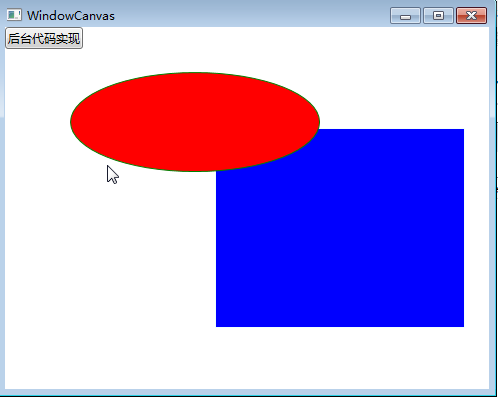
接下来我们来看两个实例,第一个实例使用XAML代码实现:
<Window x:Class="WpfApp1.WindowCanvas"
        xmlns="http://schemas.microsoft.com/winfx/2006/xaml/presentation"
        xmlns:x="http://schemas.microsoft.com/winfx/2006/xaml"
        Title="WindowCanvas" Height="400" Width="500">
    <Grid>
        <Canvas Margin="0,0,0,0" Background="White">
            <Rectangle Fill="Blue"
                Stroke="Azure"
                Width="250"
                Height="200"
                Canvas.Left="210" Canvas.Top="101"/>
            <Ellipse Fill="Red"
                Stroke="Green"
                Width="250" Height="100"
                Panel.ZIndex="1"
                Canvas.Left="65" Canvas.Top="45"/>
        </Canvas>
        <Canvas>
            <Button Name="btnByCode" Click="btnByCode_Click">后台代码实现</Button>
        </Canvas>
    </Grid>
</Window>
实例后的效果如下图。
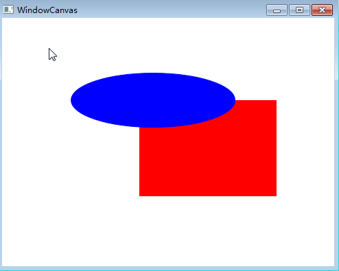
第二个实例,我们使用后台代码来实现。我使用C#来实现
using System;
using System.Collections.Generic;
using System.Linq;
using System.Text;
using System.Threading.Tasks;
using System.Windows;
using System.Windows.Controls;
using System.Windows.Data;
using System.Windows.Documents;
using System.Windows.Input;
using System.Windows.Media;
using System.Windows.Media.Imaging;
using System.Windows.Shapes;

namespace WpfApp1
{
    /// <summary>
    /// WindowCanvas.xaml 的交互逻辑
    /// </summary>
    public partial class WindowCanvas : Window
    {
        public WindowCanvas()
        {
            InitializeComponent();
        }

        public void DisplayCanvas()
        {
            Canvas canv = new Canvas();

            //把canv添加为窗体的子控件
            this.Content = canv;
            canv.Margin = new Thickness(0, 0, 0, 0);
            canv.Background = new SolidColorBrush(Colors.White);

            //Rectangle
            Rectangle r = new Rectangle();
            r.Fill = new SolidColorBrush(Colors.Red);
            r.Stroke = new SolidColorBrush(Colors.Red);
            r.Width = 200;
            r.Height = 140;
            r.SetValue(Canvas.LeftProperty, (double)200);
            r.SetValue(Canvas.TopProperty, (double)120);
            canv.Children.Add(r);

            //Ellipse
            Ellipse el = new Ellipse();
            el.Fill = new SolidColorBrush(Colors.Blue);
            el.Stroke = new SolidColorBrush(Colors.Blue);
            el.Width = 240;
            el.Height = 80;
            el.SetValue(Canvas.ZIndexProperty, 1);
            el.SetValue(Canvas.LeftProperty, (double)100);
            el.SetValue(Canvas.TopProperty, (double)80);
            canv.Children.Add(el);
        }

        private void btnByCode_Click(object sender, RoutedEventArgs e)
        {
            DisplayCanvas();
        }
    }
}
实现后的效果如下图。
最后 要说明一点Canvas内的子控件不能使用两个以上的Canvas附加属性,如果同时设置Canvas.Left和Canvas.Right属性,那么后者将会被忽略。
三. WrapPanel
WrapPanel布局面板将各个控件从左至右按照行或列的顺序罗列,当长度或高度不够是就会自动调整进行换行,后续排序按照从上至下或从右至左的顺序进行。
Orientation——根据内容自动换行。当 Horizontal选项看上去类似于Windows资源管理器的缩略图视图:元素是从左向右排列的,然后自上至下自动换行。Vertical 选项看上去类似于Windows资源管理器的列表视图:元素是从上向下排列的,然后从左至右自动换行。
ItemHeight——所有子元素都一致的高度。每个子元素填充高度的方式取决于它的VerticalAlignment属性、Height属性等。任何比ItemHeight高的元素都将被截断。
ItemWidth——所有子元素都一致的宽度。每个子元素填充高度的方式取决于它的VerticalAlignment属性、Width属性等。任何比ItemWidth高的元素都将被截断。
本次的示例,效果图如下2图,图1是宽度比较小,图2就是拉长了宽度后的结果。大家可以在实际做出来之后,自行拉动窗体的宽度:
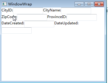 图1
图1

图2
上面两图的XAML代码实现:
<Window x:Class="WpfApp1.WindowWrap"
        xmlns="http://schemas.microsoft.com/winfx/2006/xaml/presentation"
        xmlns:x="http://schemas.microsoft.com/winfx/2006/xaml"
        Title="WindowWrap" Height="300" Width="400">
    <Grid>
        <WrapPanel  Orientation="Horizontal">
            <TextBlock Name="textBlock_CityID" Text="CityID:" />
            <TextBox Name="textBox_CityID" MinWidth="100" />
            <TextBlock Name="textBlock_CityName" Text="CityName:" />
            <TextBox Name="textBox_CityName" MinWidth="100" />
            <TextBlock Name="textBlock_ZipCode" Text="ZipCode:" />
            <TextBox Name="textBox_ZipCode" MinWidth="100"  />
            <TextBlock Name="textBlock_ProvinceID" Text="ProvinceID:" />
            <TextBox Name="textBox_ProvinceID" MinWidth="100"   />
            <TextBlock Name="textBlock_DateCreated" Text="DateCreated:"  />
            <TextBox Name="textBox_DateCreated" MinWidth="100"   />
            <TextBlock Name="textBlock_DateUpdated" Text="DateUpdated:" />
            <TextBox Name="textBox_DateUpdated" MinWidth="100" />
        </WrapPanel>
    </Grid>
</Window>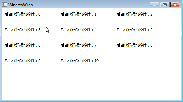
C#代码实现上图示例:
using System;
using System.Collections.Generic;
using System.Linq;
using System.Text;
using System.Threading.Tasks;
using System.Windows;
using System.Windows.Controls;
using System.Windows.Data;
using System.Windows.Documents;
using System.Windows.Input;
using System.Windows.Media;
using System.Windows.Media.Imaging;
using System.Windows.Shapes;

namespace WpfApp1
{
    /// <summary>
    /// WindowWrap.xaml 的交互逻辑
    /// </summary>
    public partial class WindowWrap : Window
    {
        public WindowWrap()
        {
            InitializeComponent();
        }

        private void btnAddByCode_Click(object sender, RoutedEventArgs e)
        {
            WrapPanel wp = new WrapPanel();

            //把wp添加为窗体的子控件
            this.Content = wp;
            wp.Margin = new Thickness(0, 0, 0, 0);
            wp.Background = new SolidColorBrush(Colors.White);

            //遍历增加TextBlock
            TextBlock block;
            for (int i = 0; i <= 10; i++)
            {
                block = new TextBlock();
                block.Text = "后台代码添加控件:" + i.ToString();
                block.Margin = new Thickness(10, 10, 10, 10);
                block.Width = 160;
                block.Height = 30;
                wp.Children.Add(block);
            }
        }
    }
}四.StackPanel
StackPanel就是将控件按照行或列来顺序排列,但不会换行。通过设置面板的Orientation属性设置了两种排列方式:横排(Horizontal默认的)和竖排(Vertical)。纵向的StackPanel默 认每个元素宽度与面板一样宽,反之横向亦然。如果包含的元素超过了面板空间,它只会截断多出的内容。 元素的Margin属性用于使元素之间产生一定得间隔,当元素空间大于其内容的空间时,剩余空间将由HorizontalAlignment和 VerticalAlignment属性来决定如何分配。
本示例要实现的效果如下2图,图1是横排,图2是竖排。
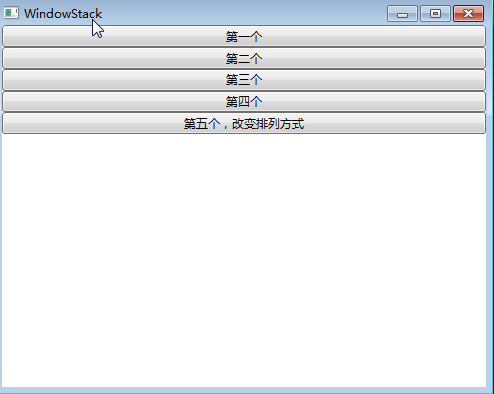
图1
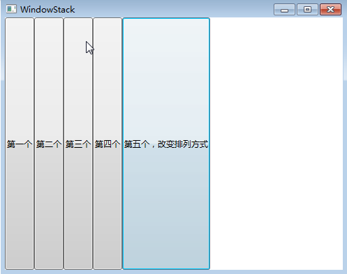
图2
上两图的XAML代码实现:
<Window x:Class="WpfApp1.WindowStack"
        xmlns="http://schemas.microsoft.com/winfx/2006/xaml/presentation"
        xmlns:x="http://schemas.microsoft.com/winfx/2006/xaml"
        Title="WindowStack" Height="400" Width="500">
    <Grid>
        <StackPanel Name="stackPanel" Margin="0,0,0,0" Background="White" Orientation="Vertical">
            <Button Content="第一个"/>
            <Button Content="第二个"/>
            <Button Content="第三个"/>
            <Button Content="第四个"/>
            <Button Content="第五个,改变排列方式" Click="Button_Click"/>
            <Button Content="后台代码实现" Click="Button_Click_1"/>
        </StackPanel>
    </Grid>
</Window>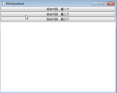
上图示例的C#代码实现:
using System;
using System.Collections.Generic;
using System.Linq;
using System.Text;
using System.Threading.Tasks;
using System.Windows;
using System.Windows.Controls;
using System.Windows.Data;
using System.Windows.Documents;
using System.Windows.Input;
using System.Windows.Media;
using System.Windows.Media.Imaging;
using System.Windows.Shapes;

namespace WpfApp1
{
    /// <summary>
    /// WindowStack.xaml 的交互逻辑
    /// </summary>
    public partial class WindowStack : Window
    {
        public WindowStack()
        {
            InitializeComponent();
        }

        private void Button_Click(object sender, RoutedEventArgs e)
        {
            stackPanel.Orientation = Orientation.Horizontal;
        }

        private void StackPanels()
        {
            StackPanel sp = new StackPanel();

            //把sp添加为窗体的子控件
            this.Content = sp;
            sp.Margin = new Thickness(0, 0, 0, 0);
            sp.Background = new SolidColorBrush(Colors.White);
            sp.Orientation = Orientation.Vertical;

            //Button1
            Button b1 = new Button();
            b1.Content = "后台代码,第一个";
            sp.Children.Add(b1);

            //Button2
            Button b2 = new Button();
            b2.Content = "后台代码,第二个";
            sp.Children.Add(b2);

            //Button3
            Button b3 = new Button();
            b3.Content = "后台代码,第三个";
            sp.Children.Add(b3);
        }

        private void Button_Click_1(object sender, RoutedEventArgs e)
        {
            StackPanels();
        }
    }
}
注: 当把StackPanel的FlowDirection属性设置为RightToLeft,Orientation属性设置为Horizontal,StackPanel将从右向左排列元素。
五. Grid
Grid顾名思义就是“网格”,它的子控件被放在一个一个实现定义好的小格子里面,整齐配列。 Grid和其他各个Panel比较起来,功能最多也最为复杂。要使用Grid,首先要向RowDefinitions和ColumnDefinitions属性中添加一定数量的RowDefinitions和 ColumnDefinitions元素,从而定义行数和列数。而放置在Grid面板中的控件元素都必须显示采用附加属性语法定义其 放置所在的行和列,它们都是以0为基准的整型 值,如果没有显式设置任何行或列,Grid将会隐式地将控件加入在第0行第0列。由于Grid的组成并非简单的添加属性标记来区分行列,这也使得用户在实际应用中可以具体到某一单 元格中,所以布局起来就很精细了。
Grid的单元格可以是空的,一个单元格中可以有多个元素,而在单元格中元素是根据它们的Z顺序一个接着一个呈现的。与Canvas一样,同一个单元格中 的子元素不会与其他元素交互布局,信息——它们仅仅是重叠而已。接下来我们来使用一些实际的代码演示一下如何使用GRID。
1) Grid的列宽与行高可采用固定、自动、按比列三种方式定义
<Grid>
    <Grid.RowDefinitions>
        <RowDefinition Height="Auto" />
        <RowDefinition Height="Auto" />
        <RowDefinition Height="*" />
        <RowDefinition Height="40" />
    </Grid.RowDefinitions>
    <Grid.ColumnDefinitions>
        <ColumnDefinition Width="Auto" />
        <ColumnDefinition Width="300" />
    </Grid.ColumnDefinitions>
</Grid>
注意:这里介绍一下Grid高度、宽度的几种定义方式:
| 名称 | 说明 |
| 绝对尺寸 | 就是给一个实际的数字,但通常将此值指定为整数,像上图中中那样 |
| 自动(Autosizing) | 值为Auto,实际作用就是取实际控件所需的最小值 |
| StarSizing | 值为*或N*,实际作用就是取尽可能大的值,当某一列或行被定义为*则是尽可能大,当出现多列或行被定义为*则是代表几者之间按比例方设置尺寸 |
第一种,固定长度——宽度不够,会裁剪,不好用。单位pixel。
第二种,自动长度——自动匹配列中最长元素的宽度。
第三种,比例长度——*表示占用剩余的全部宽度;两行都是*,将平分剩余宽度;像上面的一个2*,一个*,表示前者2/3宽度。
2) 跨越多行和多列
<Rectangle Fill="Silver" Grid.Column="1" Grid.ColumnSpan="3"/>
使用Grid.ColumnSpan和Grid.RowSpan附加属性可以让相互间隔的行列合并,所以元素也可以跨越多个单元格。
3) 使用GridSplit分割
<GridSplitter Height="6" VerticalAlignment="Stretch" HorizontalAlignment="Stretch"
               Grid.Row="2" Grid.Column="2"></GridSplitter>
使用GridSplit控件结合Grid控件实现类似于WinForm中SplitContainer的功能,这个大家在WinForm当中经常用到,我们也不多做介绍。
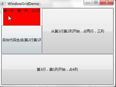
4) XAML代码实现下图效果(用XAML):
<Window x:Class="WpfApp1.WindowGridDemo"
        xmlns="http://schemas.microsoft.com/winfx/2006/xaml/presentation"
        xmlns:x="http://schemas.microsoft.com/winfx/2006/xaml"
        Title="WindowGridDemo" Height="300" Width="400">
    <Grid>
        <Grid.RowDefinitions>
            <RowDefinition Height="61*"/>
            <RowDefinition Height="101*"/>
            <RowDefinition Height="108*"/>
        </Grid.RowDefinitions>
        <Grid.ColumnDefinitions>
            <ColumnDefinition Width="139"/>
            <ColumnDefinition Width="184*"/>
            <ColumnDefinition Width="45*" />
            <ColumnDefinition Width="250*"/>
        </Grid.ColumnDefinitions>
        <TextBlock   Grid.Row="0" Grid.ColumnSpan="1"  Text="第一行,第一列,占1列" Background="Red" HorizontalAlignment="Center"  />
        <Button Grid.Row="0" Grid.Column="1" Grid.ColumnSpan="3" Grid.RowSpan="2" Content="从第1行第2列开始,占两行,三列" />
        <Button  Grid.Row="2" Grid.Column="0" Grid.ColumnSpan="4" Content="第3行,第1列开始,占4列" />
        <Button Grid.Row="1" Name="btnAddByCode" Click="btnAddByCode_Click" >后台代码生成(第2行第1列)</Button>
    </Grid>
</Window>
5) 下图,以C#代码实现:
using System;
using System.Collections.Generic;
using System.Linq;
using System.Text;
using System.Threading.Tasks;
using System.Windows;
using System.Windows.Controls;
using System.Windows.Data;
using System.Windows.Documents;
using System.Windows.Input;
using System.Windows.Media;
using System.Windows.Media.Imaging;
using System.Windows.Shapes;
namespace WpfApp1
{
/// <summary>
/// WindowGridDemo.xaml 的交互逻辑
/// </summary>
public partial class WindowGridDemo : Window
{
public WindowGridDemo()
{
InitializeComponent();
}
public void btnAddByCode_Click(object sender, RoutedEventArgs e)
{
Grid grid = new Grid();
grid.Width = Double.NaN; //相当于在XAML中设置Width="Auto"
grid.Height = Double.NaN; //相当于在XAML中设置Height="Auto"
//把grid添加为窗体的子控件
this.Content = grid;
//列一
ColumnDefinition cd1 = new ColumnDefinition();
cd1.Width = new GridLength(139);
grid.ColumnDefinitions.Add(cd1);
//列二
ColumnDefinition cd2 = new ColumnDefinition();
cd2.Width = new GridLength(1, GridUnitType.Star);
grid.ColumnDefinitions.Add(cd2);
//列三
ColumnDefinition cd3 = new ColumnDefinition();
cd3.Width = new GridLength(2, GridUnitType.Star);
grid.ColumnDefinitions.Add(cd3);
//行一
RowDefinition row1 = new RowDefinition();
row1.Height = new GridLength(61);
grid.RowDefinitions.Add(row1);
//行二
RowDefinition row2 = new RowDefinition();
row2.Height = new GridLength(1, GridUnitType.Star);
grid.RowDefinitions.Add(row2);
//行三
RowDefinition row3 = new RowDefinition();
row3.Height = new GridLength(200);
grid.RowDefinitions.Add(row3);
//把单元格添加到grid中
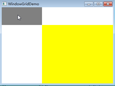
Rectangle r0c1 = new Rectangle();
r0c1.Fill = new SolidColorBrush(Colors.Gray);
r0c1.SetValue(Grid.ColumnProperty, 0);
r0c1.SetValue(Grid.RowProperty, 0);
grid.Children.Add(r0c1);
Rectangle r1c23 = new Rectangle();
r1c23.Fill = new SolidColorBrush(Colors.Yellow);
r1c23.SetValue(Grid.ColumnProperty, 1);
r1c23.SetValue(Grid.ColumnSpanProperty, 2);
r1c23.SetValue(Grid.RowProperty, 1);
r1c23.SetValue(Grid.RowSpanProperty, 2);
grid.Children.Add(r1c23);
}
}
}六、 UniformGrid
介绍了前面的Grid,接下来介绍的这个UniformGrid 就是Grid的简化版,每个单元格的大小相同,不需要定义行列集合。每个单元格始终具有相同的大小,每个单元格只能容纳一个控件,将自动按照定义在其内部的元素个数,自动创建行列,并通常保持相同的行列数。UniformGrid 中没有Row 和Column 附加属性,也没有空白单元格。
与Grid布局控件相比,UniformGrid布局控件很少使用。Grid面板是用于创建简单乃至复杂窗口布局的通用工具。UniformGrid面板是一个一种更特殊的布局容器,主要用于在一个刻板的网格中快速地布局元素。
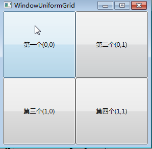
下面用XAML代码实现一个示例,该示例使用4个按钮填充UniformGrid面板。:
<Window x:Class="WpfApp1.WindowUniformGrid"
        xmlns="http://schemas.microsoft.com/winfx/2006/xaml/presentation"
        xmlns:x="http://schemas.microsoft.com/winfx/2006/xaml"
        Title="WindowUniformGrid" Height="300" Width="300">
    <Grid>
        <UniformGrid Rows="2" Columns="2">
            <Button>第一个(0,0)</Button>
            <Button>第二个(0,1)</Button>
            <Button>第三个(1,0)</Button>
            <Button Name="btnAddByCode" Click="btnAddByCode_Click">第四个(1,1)</Button>
        </UniformGrid>
    </Grid>
</Window>
下面使用C#代码实现10个TextBlock的控件的布局。
using System;
using System.Collections.Generic;
using System.Linq;
using System.Text;
using System.Threading.Tasks;
using System.Windows;
using System.Windows.Controls;
using System.Windows.Controls.Primitives;
using System.Windows.Data;
using System.Windows.Documents;
using System.Windows.Input;
using System.Windows.Media;
using System.Windows.Media.Imaging;
using System.Windows.Shapes;

namespace WpfApp1
{

    /// <summary>
    /// WindowUniformGrid.xaml 的交互逻辑
    /// </summary>
    public partial class WindowUniformGrid : Window
    {
        public WindowUniformGrid()
        {
            InitializeComponent();
        }

        public void btnAddByCode_Click(object sender, RoutedEventArgs e)
        {
            UniformGrid wp = new UniformGrid();

            //把wp添加为窗体的子控件
            this.Content = wp;
            wp.Margin = new Thickness(0, 0, 0, 0);
            wp.Background = new SolidColorBrush(Colors.Red);

            //遍历增加Rectangles
            TextBlock block;
            for (int i = 0; i <= 10; i++)
            {
                block = new TextBlock();
                block.Text = string.Format("第{0}个", i);
                wp.Children.Add(block);
            }
        }
    }
}
七. DockPanel
DockPanel定义一个区域,在此区域中,您可以使子元素通过描点的形式排列,这些对象位于 Children 属性中。停靠面板其实就是在WinForm类似于Dock属性的元 素。DockPanel会对每个子元素进行排序,并停靠在面板的一侧,多个停靠在同侧的元素则按顺序排序。
如果将 LastChildFill 属性设置为 true(默认设置),那么无论对 DockPanel 的最后一个子元素设置的其他任何停靠值如何,该子元素都将始终填满剩余的空间。若要将子元素停靠在另一个方向,必须将 LastChildFill 属性设置为 false,还必须为最后一个子元素指定显式停靠方向。
默认情况下,面板元素并不接收焦点。要强制使面板元素接收焦点,请将 Focusable 属性设置为 true。
注意:屏幕上 DockPanel 的子元素的位置由相关子元素的 Dock 属性以及这些子元素在 DockPanel 下的相对顺序确定。因此,具有相同 Dock 属性值的一组子元素在屏幕上的位置可能不同,具体取决于这些子元素在 DockPanel 下的顺序。子元素的顺序会影响定位,因为 DockPanel 会按顺序迭代其子元素,并根据剩余空间来设置每个子元素的位置。
使用XAML代码实现如下图效果。图如下。
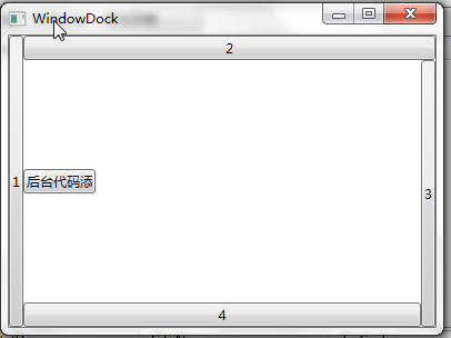
<Window x:Class="WpfApp1.WindowDock"
xmlns="http://schemas.microsoft.com/winfx/2006/xaml/presentation"
xmlns:x="http://schemas.microsoft.com/winfx/2006/xaml"
Title="WindowDock" Height="300" Width="400">
<Grid>
<DockPanel Width="Auto" Height="Auto">
<Button DockPanel.Dock="Left" Content="1" />
<Button DockPanel.Dock="Top" Content="2" />
<Button DockPanel.Dock="Right" Content="3" />
<Button DockPanel.Dock="Bottom" Content="4" />
<Button HorizontalAlignment="Left" Name="btnAddByCode" Height="22" Width="65" DockPanel.Dock=" Left " Click="btnAddByCode_Click" >后台代码添加</Button>
</DockPanel>
</Grid>
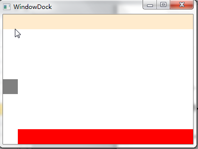
</Window>使用C#代码实现如下图效果。图如下。
using System;
using System.Collections.Generic;
using System.Linq;
using System.Text;
using System.Threading.Tasks;
using System.Windows;
using System.Windows.Controls;
using System.Windows.Data;
using System.Windows.Documents;
using System.Windows.Input;
using System.Windows.Media;
using System.Windows.Media.Imaging;
using System.Windows.Shapes;
namespace WpfApp1
{
    /// <summary>
    /// WindowDock.xaml 的交互逻辑
    /// </summary>
    public partial class WindowDock : Window
    {
        public WindowDock()
        {
            InitializeComponent();
        }
        private void btnAddByCode_Click(object sender, RoutedEventArgs e)
        {
            DockPanel dp = new DockPanel();
            //  dp.LastChildFill = true;
            dp.Width = Double.NaN;    //相当于在XAML中设置Width="Auto"
            dp.Height = Double.NaN;   //相当于在XAML中设置Height="Auto"
            //把dp添加为窗体的子控件
            this.Content = dp;
            //添加Rectangles
            Rectangle rTop = new Rectangle();
            rTop.Fill = new SolidColorBrush(Colors.BlanchedAlmond);
            rTop.Stroke = new SolidColorBrush(Colors.BlanchedAlmond);
            rTop.Height = 30;
            dp.Children.Add(rTop);
            rTop.SetValue(DockPanel.DockProperty, Dock.Top);
            Rectangle rLeft = new Rectangle();
            rLeft.Fill = new SolidColorBrush(Colors.Gray);
            rLeft.Stroke = new SolidColorBrush(Colors.Gray);
            rLeft.HorizontalAlignment = HorizontalAlignment.Left;
            rLeft.Height = 30;
            rLeft.Width = 30;
            dp.Children.Add(rLeft);
            rLeft.SetValue(DockPanel.DockProperty, Dock.Left);
            Rectangle rBottom = new Rectangle();
            rBottom.Fill = new SolidColorBrush(Colors.Red);
            rBottom.VerticalAlignment = VerticalAlignment.Bottom;
            rBottom.Height = 30;
            dp.Children.Add(rBottom);
            rBottom.SetValue(DockPanel.DockProperty, Dock.Bottom);
        }
    }
}
八. ViewBox
ViewBox这个控件通常和其他控件结合起来使用,是WPF中非常有用的控件。定义一个内容容器。ViewBox组件的作用是拉伸或延展位于其中的组件,以填满可用空间,使之有更好的布局及视觉效果。
一个 Viewbox中只能放一个控件。如果多添加了一个控件就会报错。如下图。
组件常用属性:
Child:获取或设置一个ViewBox元素的单一子元素。
Stretch:获取或设置拉伸模式以决定该组件中的内容以怎样的形式填充该组件的已有空间。具体设置值如下:
成员名称 |
说明 |
None |
内容保持其原始大小。 |
Fill |
调整内容的大小以填充目标尺寸。 不保留纵横比。 |
Uniform |
在保留内容原有纵横比的同时调整内容的大小,以适合目标尺寸。 |
UniformToFill |
在保留内容原有纵横比的同时调整内容的大小,以填充目标尺寸。 如果目标矩形的纵横比不同于源矩形的纵横比,则对源内容进行剪裁以适合目标尺寸。 |
StretchDirection:获取或设置该组件的拉伸方向以决定该组件中的内容将以何种形式被延展。具体的设置值如下。
成员名称 |
说明 |
UpOnly |
仅当内容小于父项时,它才会放大。 如果内容大于父项,不会执行任何缩小操作。 |
DownOnly |
仅当内容大于父项时,它才会缩小。 如果内容小于父项,不会执行任何放大操作。 |
Both |
内容根据 Stretch 属性进行拉伸以适合父项的大小。 |
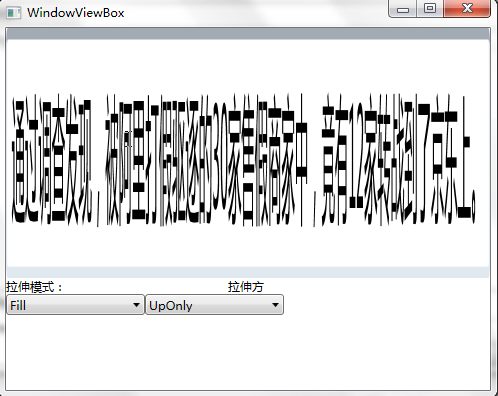
接下来我们做个示例,你可以通过选择下拉框中的不同设置值,来查看不同的效果。效果如下图。
XAML代码实现:
<Window x:Class="WpfApp1.WindowViewBox"
xmlns="http://schemas.microsoft.com/winfx/2006/xaml/presentation"
xmlns:x="http://schemas.microsoft.com/winfx/2006/xaml"
Title="WindowViewBox" Height="400" Width="500" Loaded="Window_Loaded">
<Grid>
<Grid.RowDefinitions>
<RowDefinition Height="250"/>
<RowDefinition Height="auto"/>
<RowDefinition Height="73*"/>
</Grid.RowDefinitions>
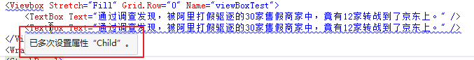
<Viewbox Stretch="Fill" Grid.Row="0" Name="viewBoxTest">
<TextBox Text="通过调查发现,被阿里打假驱逐的30家售假商家中,竟有12家转战到了京东上。" />
</Viewbox>
<WrapPanel Grid.Row="2">
<StackPanel>
<TextBlock Height="16" HorizontalAlignment="Left" VerticalAlignment="Bottom" Width="66" Text="拉伸模式:" TextWrapping="Wrap"/>
<ComboBox x:Name="cbStretch" Height="21" HorizontalAlignment="Left" VerticalAlignment="Bottom" Width="139" SelectionChanged="cbStretch_SelectionChanged"/>
</StackPanel>
<StackPanel>
<TextBlock Height="16" HorizontalAlignment="Right" VerticalAlignment="Bottom" Width="56" Text="拉伸方向:" TextWrapping="Wrap"/>
<ComboBox x:Name="cbStretchDirection" Height="21" HorizontalAlignment="Right" VerticalAlignment="Bottom" Width="139" SelectionChanged="cbStretchDirection_SelectionChanged"/>
</StackPanel>
</WrapPanel>
</Grid>
</Window>c#代码实现:
using System;
using System.Collections.Generic;
using System.Linq;
using System.Text;
using System.Threading.Tasks;
using System.Windows;
using System.Windows.Controls;
using System.Windows.Data;
using System.Windows.Documents;
using System.Windows.Input;
using System.Windows.Media;
using System.Windows.Media.Imaging;
using System.Windows.Shapes;
namespace WpfApp1
{
    /// <summary>
    /// WindowViewBox.xaml 的交互逻辑
    /// </summary>
    public partial class WindowViewBox : Window
    {
        //定义cbStretch与cbStretchDirection的数据源
        List<StretchHelper> cbStretchList = new List<StretchHelper>();
        List<StretchDirectionHelper> cbStretchDirectionList = new List<StretchDirectionHelper>();
        public WindowViewBox()
        {
            InitializeComponent();
        }
        private void BindDrp()
        { //填充各ComboBox内容
            cbStretchList.Add(new StretchHelper() { StretchModeName = "Fill", theStretchMode = Stretch.Fill });
            cbStretchList.Add(new StretchHelper() { StretchModeName = "None", theStretchMode = Stretch.None });
            cbStretchList.Add(new StretchHelper() { StretchModeName = "Uniform", theStretchMode = Stretch.Uniform });
            cbStretchList.Add(new StretchHelper() { StretchModeName = "UniformToFill", theStretchMode = Stretch.UniformToFill });
            cbStretch.ItemsSource = cbStretchList;
            cbStretch.DisplayMemberPath = "StretchModeName";
            cbStretchDirectionList.Add(new StretchDirectionHelper() { StretchDirectionName = "DownOnly", theStretchDirection = StretchDirection.DownOnly });
            cbStretchDirectionList.Add(new StretchDirectionHelper() { StretchDirectionName = "UpOnly", theStretchDirection = StretchDirection.UpOnly });
            cbStretchDirectionList.Add(new StretchDirectionHelper() { StretchDirectionName = "Both", theStretchDirection = StretchDirection.Both });
            cbStretchDirection.ItemsSource = cbStretchDirectionList;
            cbStretchDirection.DisplayMemberPath = "StretchDirectionName";
        }
        private void cbStretchDirection_SelectionChanged(object sender, SelectionChangedEventArgs e)
        {
            if (cbStretchDirection.SelectedItem != null)
            {
                viewBoxTest.StretchDirection = (cbStretchDirection.SelectedItem as StretchDirectionHelper).theStretchDirection;
            }
        }
        private void cbStretch_SelectionChanged(object sender, SelectionChangedEventArgs e)
        {
            if (cbStretch.SelectedItem != null)
            {
                viewBoxTest.Stretch = (cbStretch.SelectedItem as StretchHelper).theStretchMode;
            }
        }
        private void Window_Loaded(object sender, RoutedEventArgs e)
        {
            BindDrp();
        }
    }
    //辅助类StretchHelper
    public class StretchHelper
    {
        public string StretchModeName { get; set; }
        public Stretch theStretchMode { get; set; }
    }
    //辅助类StretchDirectionHelper
    public class StretchDirectionHelper
    {
        public string StretchDirectionName { get; set; }
        public StretchDirection theStretchDirection { get; set; }
    }
}
九. Border
Border 是一个装饰的控件,此控件绘制边框及背景,在 Border 中只能有一个子控件,若要显示多个子控件,需要将一个附加的 Panel 控件放置在父 Border 中。然后可以将子控件放置在该 Panel控件中。
Border 的几个重要属性:
Background:用用一个 Brush 对象来绘制背景 ;
BorderBrush:用一个Brush 对象来绘制边框 ;
BorderThickness:此属性设置 Border 边框的大小;
CornerRadius:此属性设置 Border 的每一个角圆的半径;
Padding:此r属性设置 Border 里的内容与边框的之间的间隔。
接下来我们使用XAML代码做个示例,通过对Border的属性设置做出扑克牌的效果。
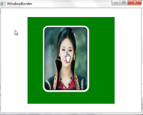
<Window x:Class="WpfApp1.WindowBorder"
        xmlns="http://schemas.microsoft.com/winfx/2006/xaml/presentation"
        xmlns:x="http://schemas.microsoft.com/winfx/2006/xaml"
        Title="WindowBorder" Height="400" Width="500">
    <Grid>
        <Canvas x:Name="mainCanvas" Background="Green" Width="300" Height="300">
            <Border BorderBrush="DarkGray" BorderThickness=".0,.0,2,2" CornerRadius="18" Width="160" Height="230" Canvas.Left="53" Canvas.Top="30">
                <Border BorderBrush="White" BorderThickness="5" CornerRadius="15" >
                    <Border BorderBrush="Black" BorderThickness="1.5" CornerRadius="15">
                        <Border.Background>
                            <ImageBrush>
                                <ImageBrush.ImageSource>
                                    <BitmapImage UriSource="meinv.png" />
                                </ImageBrush.ImageSource>
                            </ImageBrush>
                        </Border.Background>
                    </Border>
                </Border>
            </Border>
        </Canvas>
    </Grid>
</Window>
十. ScrollViewer
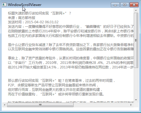
因为计算机屏幕的显示区域大小是固定的,如果我们要显示给用户看的内容,大大超出了计算机屏幕的最大显示区域、窗体、容器的限定显示页面,则超出的部分就会破坏原有的布局,这个时候我们就要使用类似于浏览器的那个滚动条的效果了。利用 ScrollViewer 控件可以方便地使应用程序中的内容具备滚动条功能。
接下来,我们来做个示例,效果如下图:
XAML代码:
<Window x:Class="WpfApp1.WindowScrollViewer"
        xmlns="http://schemas.microsoft.com/winfx/2006/xaml/presentation"
        xmlns:x="http://schemas.microsoft.com/winfx/2006/xaml"
        Title="WindowScrollViewer" Height="400" Width="500" Loaded="Window_Loaded">
    <Grid>
        <StackPanel>
            <ScrollViewer Name="scroll" Width="480"  Height="350" HorizontalScrollBarVisibility="Auto" VerticalScrollBarVisibility="Visible" >
                <TextBlock    Name="txtShowArticle"   Foreground="Gray" Margin="20,10" />
            </ScrollViewer>
        </StackPanel>
    </Grid>
</Window>
C#代码:
using System;
using System.Collections.Generic;
using System.Linq;
using System.Text;
using System.Threading.Tasks;
using System.Windows;
using System.Windows.Controls;
using System.Windows.Data;
using System.Windows.Documents;
using System.Windows.Input;
using System.Windows.Media;
using System.Windows.Media.Imaging;
using System.Windows.Shapes;
namespace WpfApp1
{
    /// <summary>
    /// WindowScrollViewer.xaml 的交互逻辑
    /// </summary>
    public partial class WindowScrollViewer : Window
    {
        public WindowScrollViewer()
        {
            InitializeComponent();
        }
        string content = @"一度赚钱赚得不好意思的中国银行业,“躺着赚钱”的好日子已经到头了。
在刚刚披露的上市银行2014年报中,除平安银行和浦发银行外,其余8家上市银行净利润增速均低于10%,其中中信银行仅为3.87%。
包括工行在内的多家国有大行和股份制银行今年净利增速相较去年腰斩。中资银行的净利增速基本进入个位数时代。
是什么让银行业快车减速?除了去年不良贷款增加之下,各家银行加大拨备吞噬净利润外,利率市场化的推进、金融脱媒的加速,
以及互联网金融来势汹汹都令银行面临挑战。这些因素的叠加正在令银行告别躺着赚钱的好日子,低速增长成为银行的“新常态”。
事实上,除了资产质量的考验外,从更长时间的维度看,中国银行业所面临的政策环境的变化已经在过去几年不断令高歌猛进的银行业净利润慢慢减缓,
以“宇宙行”工行为例,2010年、2011年净利润仍维持28 .4%、25.6%的净利润增速,
但2012年开始大幅放缓至14.5%,2013年年报仍勉强维持在两位数,2014年进一步跌至5.1%。
那么银行该如何实现“互联网+”呢?在笔者看来,过去的两年时间里,
P2P、余额宝等新生产品尽管让互联网金融看起来格外热闹,
但对银行而言,互联网金融更大的意义并非在渠道的重新构建,
而在于价值链重构,“互联网+”或许将带领银行重新发现价值。
除了表面热闹的互联网渠道的应用外,对于银行而言,更为重要的是通过互联网激活大数据,重新构建银行的价值链。
首先,其基础应该在于,其底层的生态搭建,体现在支付清算体系、征信体系等的基础技术的改造上。
其次,在此过程中,银行可以实现再度的价值发现,如通过虚拟账户、远程账户的变革,
将零售业务往移动端迁移,开发长尾用户;并将利润从此前的规模导向转为资金的流转速度上,
同时利用大数据及供应链才能真正打开银行小微信用蓝海。
从上周工行发布的一系列互联网金融产品主要围绕支付、社交以及移动端的零售可以看出类似的思路。 ";
        private void ShowArticle()
        {
            //获取私信信息
            StringBuilder strMessage = new StringBuilder();
            strMessage.Append("标题" + "失速的银行该如何实现“互联网+”?" + "\r\n");
            strMessage.Append("来源:" + "南方都市报" + "\r\n");
            strMessage.Append("发送时间:" + "2015-04-02 06:31:32" + "\r\n");
            strMessage.Append("发送内容:" + content + "\r\n\n");
            txtShowArticle.Text = strMessage.ToString();
        }
        private void Window_Loaded(object sender, RoutedEventArgs e)
        {
            ShowArticle();
        }
    }
}
十一.布局综合应用
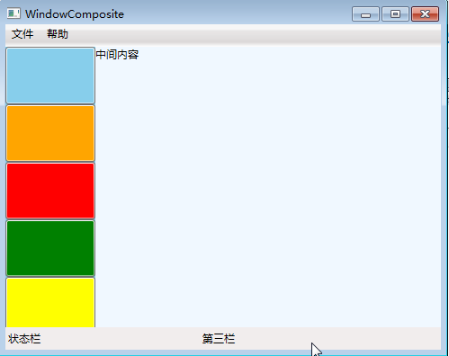
前面通过九个小节讲了一些常用Panel的基本用法,那我们这里就简单做一个综合的小例子,通过这个例子,旨在巩固前面学习的内容,温故而知新的过程。要实现的效果如下图:
XAML代码实现:
<Window x:Class="WpfApp1.WindowComposite"
        xmlns="http://schemas.microsoft.com/winfx/2006/xaml/presentation"
        xmlns:x="http://schemas.microsoft.com/winfx/2006/xaml"
        Title="WindowComposite" Height="400" Width="500">
    <Grid >
        <Grid.RowDefinitions>
            <RowDefinition Height="105*"/>
            <RowDefinition Height="25"/>
        </Grid.RowDefinitions>
        <DockPanel LastChildFill="True" Grid.Row="0">
            <! —顶部,加一个菜单-->
            <Menu   Height="25"  Width="Auto" Name="menuTop" DockPanel.Dock="Top" >
                <MenuItem Header="文件" HorizontalAlignment="Left">
                    <MenuItem Header="打开" />
                    <MenuItem Header="保存" />
                </MenuItem>
                <MenuItem Header="帮助" HorizontalAlignment="Left">
                    <MenuItem Header="查看帮助" />
                    <MenuItem Header="技术支持" />
                    <Separator />
                    <MenuItem Header="关于" />
                </MenuItem>
            </Menu>
            <!--左边栏-->
            <Canvas Width="100" x:Name="cvsGround"  DockPanel.Dock="Left" Background="Gray">
                <WrapPanel Width="100"  x:Name="grdTransfer" Canvas.Left="0"
Background="SkyBlue" PreviewMouseLeftButtonDown="grdTest_PreviewMouseLeftButtonDown"
PreviewMouseLeftButtonUp="grdTest_PreviewMouseLeftButtonUp" Orientation="Horizontal">
                    <Button Width="100" Height="64"  x:Name="btn1" Background="SkyBlue" />
                    <Button Width="100" Height="64" x:Name="btn2" Background="Orange" />
                    <Button Width="100" Height="64" x:Name="btn3" Background="Red" />
                    <Button Width="100" Height="64" x:Name="btn4" Background="Green" />
                    <Button Width="100" Height="64"  x:Name="btn5" Background="Yellow" />
                </WrapPanel>
            </Canvas>
            <Canvas>
                <Viewbox Stretch="Fill">
                    <TextBlock Text="中间内容" Background="AliceBlue" Width="393" Height="319"></TextBlock>
                </Viewbox>
            </Canvas>
        </DockPanel>
        <! —底部,加一个状态栏-->
        <StatusBar Height="25" Name="StatusBar1"  Grid.Row="1">
            <StatusBarItem Content="状态栏" Name="S1" HorizontalAlignment="Left"/>
            <StatusBarItem Content="" Name="lblCurrTime"/>
            <StatusBarItem Content="第三栏" Name="StatusBar3" Width="100"/>
        </StatusBar>
    </Grid>
</Window>
其实用熟练上面的各个布局控件以后,你会发现布局UI是一件非常容易的事,遇到一个新的UI,你会发现任意一个Panel都可以实现你的需求。
(本文转载自:http://www.cnblogs.com/chillsrc/)